You built the landing page. You’re driving traffic to it. But visitors keep leaving without doing anything.
That’s the most frustrating part of running a WordPress site. You did the hard work. But the conversions aren’t following.
Here’s the thing: most landing pages fail for the same reasons. Weak trust signals. No urgency. A call-to-action that doesn’t stand out. Visitors land, look around, and leave because nothing compels them to stay.
The good news? These are fixable problems. And you don’t need to be a developer to fix them.
In this guide, I’ll walk you through the exact tips and tools that move the needle on landing page conversions.
Whether you’re collecting leads, selling a product, or promoting a service, these strategies work for any WordPress landing page.
Here is a table of contents so that you can skip to any section of the article you want to read.
Let’s dig in.
Importance of a Good Landing Page
First, let us point out that you can use many marketing strategies, other than landing pages, to improve conversions on your website.
For example, content marketing is an excellent way to position yourself as an authority in your industry, building trust and encourages visitors to engage. Plus, you can make your site SEO-friendly through content marketing, creating steady organic traffic.
The problem with this marketing tactic is that creating content that converts is time-consuming and expensive. On top of this, it also takes time to see results.
Another marketing method you can use is email marketing.
This powerful marketing tool can guide potential clients through a series of interactions, slowly moving them closer towards conversion. But, with email marketing, there are often a lot of drop-offs during the conversion process.
You can also use a referral program, encouraging your existing customers to bring in new clients. The issue is that you do not have much control over who your customers refer to you. As a result, it can be hard to convert them.
This is why using a well-optimized landing page can be your best marketing solution!
A well-designed landing page remains one of the most effective methods of achieving a specific conversion goal. Unlike other marketing techniques, a landing page is designed with a single, clear objective.
This reduces distractions and keeps the user focused on what is most important on the page. This direct approach reduces the chances of visitors dropping off before taking action.
To add to this, landing pages offer more immediate results, unlike strategies like SEO, which require time to build authority and drive traffic. You can pair your landing page with advertising, such as Google Ads, to further increase results.
Plus, they are easy to execute and manage.
You can quickly customize landing pages, monitor key metrics, and target specific audiences effectively.
Despite these advantages, many businesses miss important conversion elements on their landing pages, such as a strong CTA or a compelling reason for visitors to act.
Now that you understand the importance of a well-created landing page let us look at tips and tools to improve conversion rates.
Tips and Tools to Improve Landing Page Conversion Rates
1. Focus on Simplicity on Your Landing Page
A crowded landing page can often look spammy, leading to users losing trust in your site. Plus, when visitors are overwhelmed by too many elements on your site, the core message of your page gets lost.
This not only reduces the impact of your call-to-action (CTA) but can also reduce your conversion rates.
To counter this, focus on simplicity!
Your landing page should focus on a clear, concise message. This ensures that users quickly understand what you’re offering, which makes them more likely to engage with your CTA. It also makes it easier for you to highlight your product features or advantages.
On top of this, with fewer elements on the page, it becomes easier to perform A/B testing to determine what works best for your audience.
Now, we know that deciding which elements to keep or leave out of your landing page can be challenging, especially if you’re unsure what converts.
That is why we recommend you use landing page builders.
You can choose popular landing page builders like SeedProd and Thrive Architect, which we use here at IsItWP.
For starters, SeedProd offers over 300 landing page templates designed for various purposes, such as sales, webinars, login pages, and more. The best part is these templates already come packed with conversion-focused page elements.
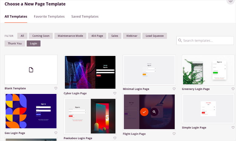
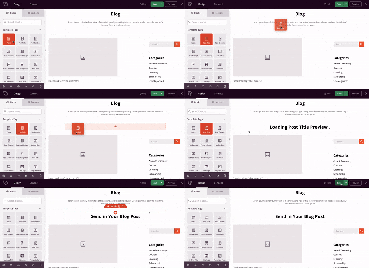
To add to this, these templates are also highly customizable. This means you can edit them using a drag and drop interface to remove elements you do not want or add new ones. As a result, you can tailor each template to your specific needs.
For more details, check out the latest SeedProd review here.
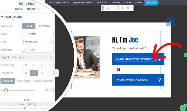
On the other hand, Thrive Architect also provides a drag and drop builder with over 300 conversion-ready templates.
This gives you more ways to design your landing page. It also makes it simple to create a streamlined, effective landing page that directs users’ attention exactly where you want it.
To see all that this landing page builder can do, check out the latest Thrive Architect review here.
But remember that many page builders come with templates to help you build. If you want more alternatives, here is an article on the best page builders.
2. Build Trust with Your Audience
Building trust is often the biggest hurdle for new and small businesses in converting visitors into customers. Established businesses naturally benefit from their long-standing presence, which creates trust.
But what can newer and smaller businesses do to bridge this gap?
One of the most effective ways to build trust is by adding social proof to your landing page.
Social proof is a powerful psychological tool that influences people’s decisions. When potential customers see others taking action, such as making a purchase or joining your newsletter, they are more likely to follow suit.
This is where a tool like TrustPulse come into play.
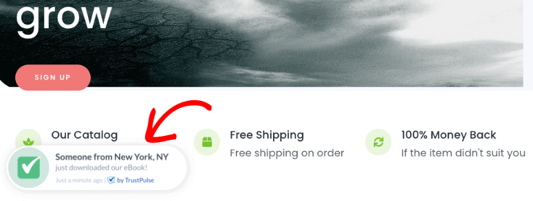
TrustPulse allows you to display a live stream of visitors’ actions on your site. For example, you can show a popup notification whenever someone makes a purchase or downloads an eBook. This encourages others to buy and serves as evidence that people are actively engaging with your business.
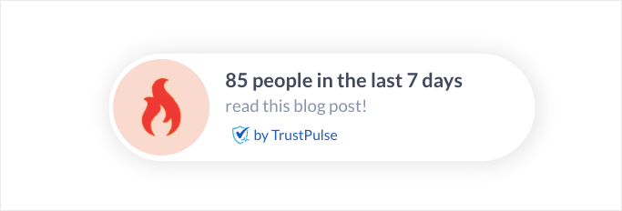
To add to this, you can use the On Fire feature from TrustPulse. This can help display notifications that show the number of people who have purchased a product within a specific timeframe.
For example, you can show a notification such as “20 people purchased this item in the last 24 hours” or “85 people read this blog in the last 7 days.”
On top of this, you can use advanced targeting rules. With this, you can control who sees these notifications and when, ensuring that the right message reaches the right audience.
Check out this TrustPulse review to see all the ways you can use this WordPress plugin for social proof.
Now, you can also use other types of social proof, such as customer testimonials, reviews, or case studies to build trust.
Such landing page elements are perfect because they show potential customers that others have had positive experiences with your business. This enhances your credibility and reassures new visitors that they can trust you.
One way to add reviews and testimonials is with SeedProd.
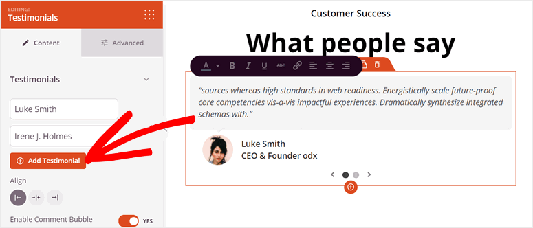
For example, you can use the “SeedProd Testimonial Block” to manually add reviews from different sources such as Yelp and Google Reviews. Since SeedProd allows you to customize every element on your landing page, you can align the testimonials perfectly with your site’s design.
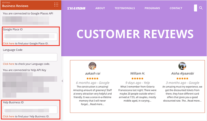
On top of that, SeedProd allows you to embed testimonials directly from Google and Yelp. This adds authenticity since users can see that the reviews are sourced from an unbiased platform. Because users can verify the reviews, you can quickly build trust, making the social proof on your landing page more impactful.
We like that you can easily embed Google and Yelp reviews using Seedprod by just using APIs.
Thrive Architect is another great option for adding testimonials to your landing page.
With its drag and drop functionality, you can place testimonial blocks anywhere on your landing page, ensuring that the testimonials blend nicely with the rest of your content.
It also allows you to add and customize testimonial elements like star ratings, author information, and icons. This ensures the testimonial social proof is more effective.
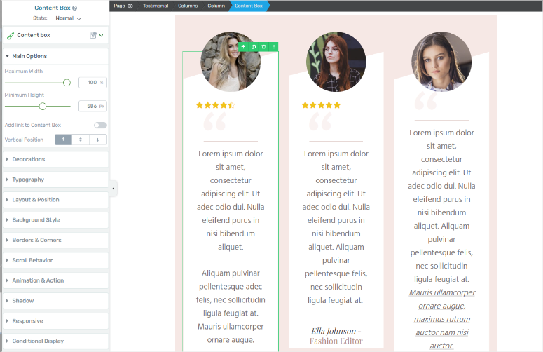
On top of this, Thrive Architect comes with pre-designed templates specifically created for testimonials, saving you time while keeping your page visually appealing.
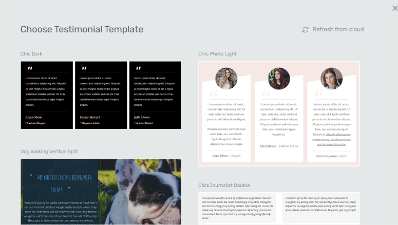
Now, since testimonials are user-generated content, it can be hard to constantly add them manually to your landing page.
A solution you can use for this problem is Thrive Ovation.
With this testimonial plugin from Thrive Themes, you can add a “Capture Testimonials” block anywhere on your site. This tool helps you create a testimonial form that lets your users submit their reviews.
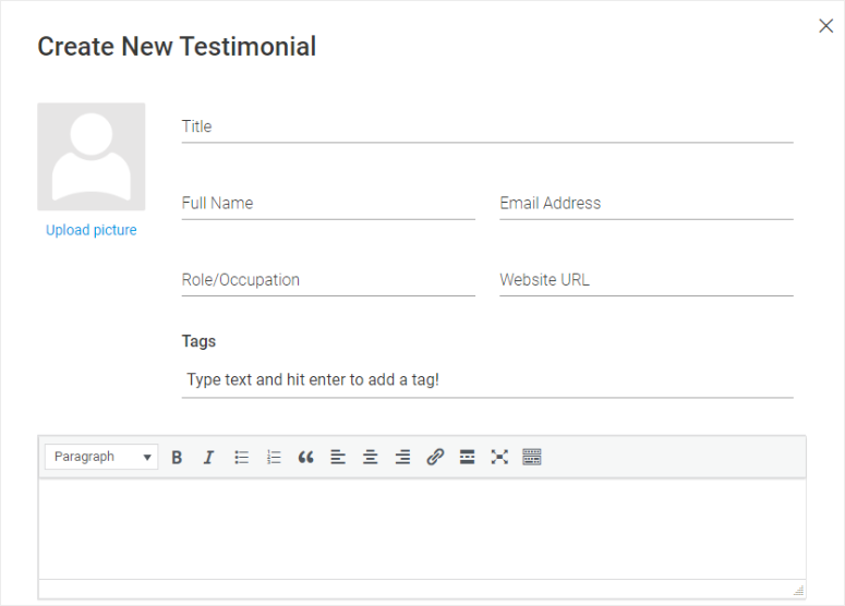
You can send automated messages asking your users for feedback, which can be used as a testimonial. After this, Thrive Ovation allows you to review the testimonials before they go live or place them immediately after the user submits them.
This ensures you can gather and display fresh reviews directly from your customers.
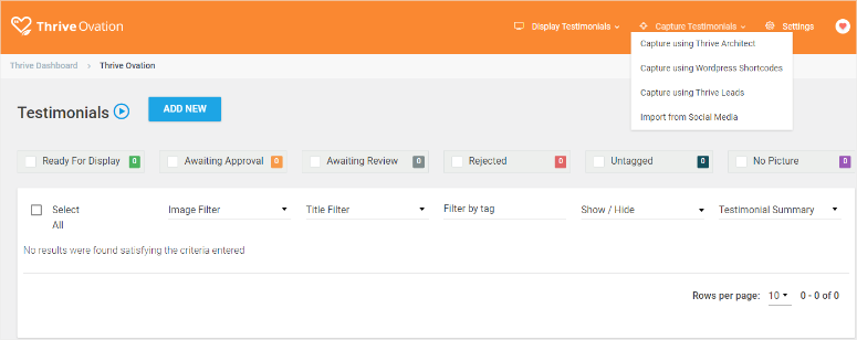
Thrive Ovation also enables you to automatically pull testimonials from various sources, including blog comments and social media. As a result, you can display the latest reviews on your landing page without constant manual updates.
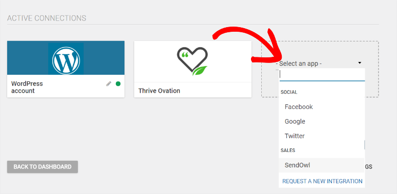
Another way to keep your testimonials fresh is through Smash Balloon Reviews Feed.
This feeds plugin allows you to automatically pull reviews from Google and Yelp and display them as a live feed on your landing page.
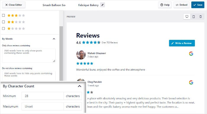
With Smash Balloon, you can add multiple review feeds and filter them to showcase only the ones you want.

This keeps your landing page dynamic. But, at the same time, it increases the perceived value of your products by displaying real-time feedback from satisfied customers.
If you are looking for different ways to showcase your users’ testimonials, check out this article on the best testimonial plugins for WordPress.
With that said, you can build trust through social proof on your website in many other ways. Check out this article on the best social proof plugins.
3. Use Animated Page Elements
The main aim of building a conversion landing page is to grab users’ attention the moment they get on your site and ensure they focus on the message.
Animations can draw the eye and guide visitors to important elements or messages on the page. They can also help with storytelling or present key information in a more dynamic way. This ensures your users understand your brand and products.
But, it is important not to over-animate your landing page, as this can lead to distractions. Instead, you should keep animations subtle and focused.
An excellent way to achieve this is through an “Animated Header.”
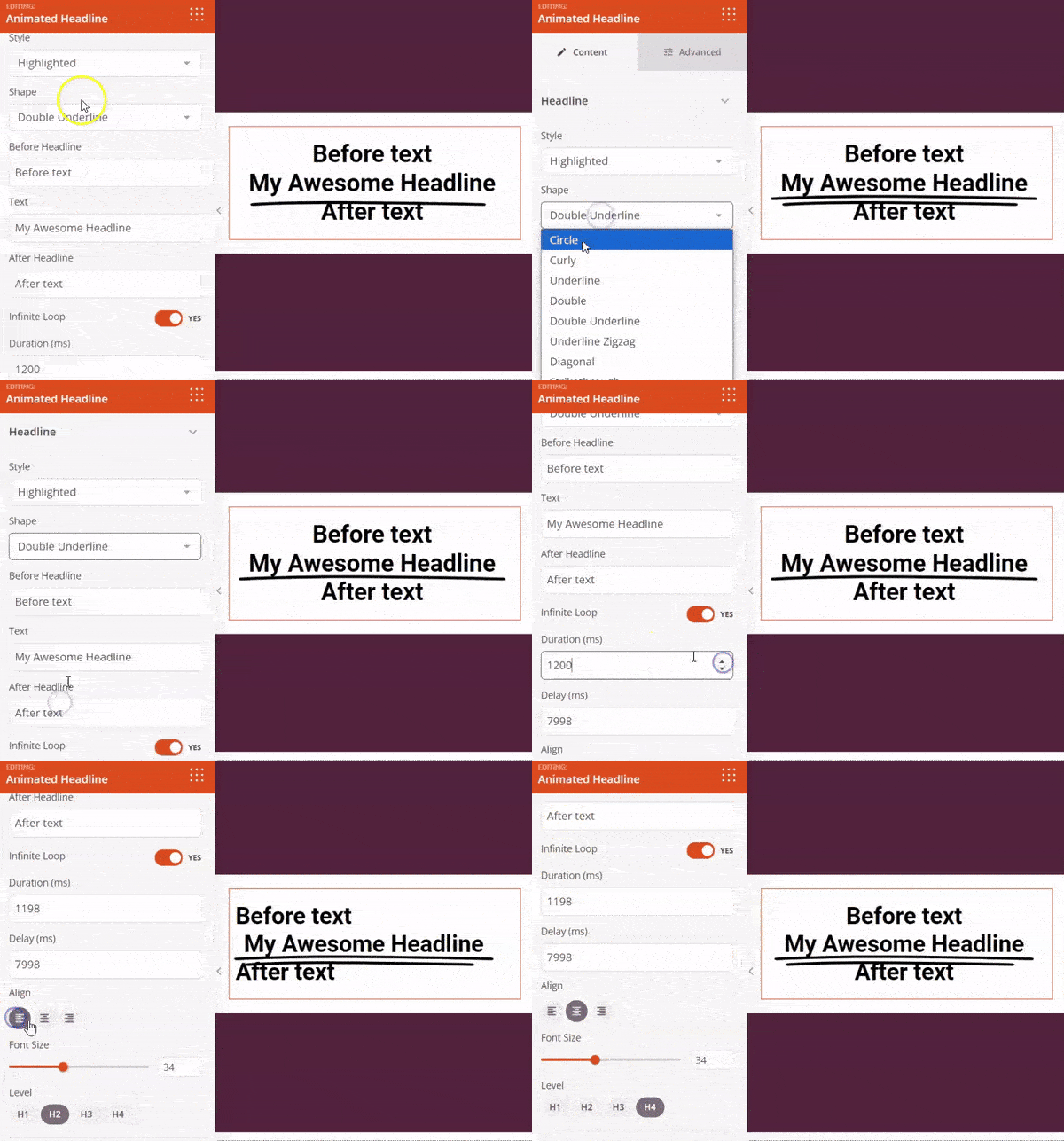
Animated headers are a powerful tool for capturing attention right from the start. Using a tool like SeedProd, you can easily create an animated header that draws users in and keeps them focused on your message.
The key to a successful animated header lies in customization. By adjusting the duration of the animation with SeedProd, you can ensure it’s long enough to catch the eye without becoming a distraction.
Plus, this drag and drop landing page builder allows you to customize the style and shape of your header animation, ensuring it aligns with your brand’s aesthetic.
To maximize user engagement, consider delaying the animation. This approach allows users to interact with the page before the animation starts, which can lead to increased time spent on the page.
On top of this, you could loop the animation to maintain user interest throughout their visit.
Another way to use animations subtly and focused, is on your call-to-action buttons.
Beyond headers, animating other key elements on your landing page can also significantly impact conversions. One such element is the call-to-action (CTA) button.
With Thrive Architect, you can bring your CTA buttons to life with animations that make them slide in, zoom in, grow, and more. These dynamic movements make your buttons more noticeable and encourage users to click.
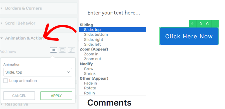
As a plus, you can add hyperlinks to these animated elements. This turns them into powerful conversion tools, guiding users towards taking the desired action.
For a more captivating animation experience, parallax scrolling is an excellent option.
In parallax scrolling, different layers of content, such as the background images, text, and graphics, move at varying speeds.
Usually, the background moves more slowly than the foreground, creating a perception of depth as your user scrolls. As a result, this effect mimics how objects appear to move at different speeds when viewed from a moving vehicle or as you walk past them.
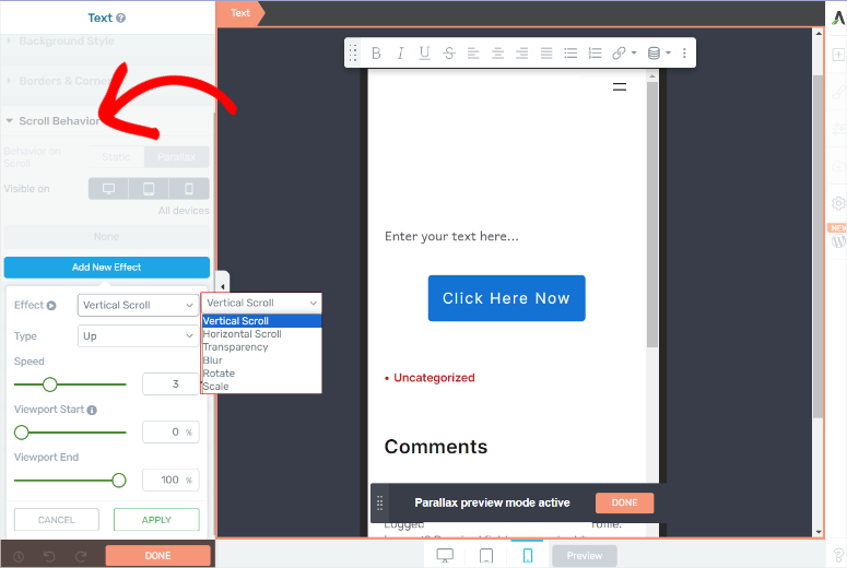
Thrive Architect allows you to add different parallax effects to your landing page easily.
For example, you can opt for vertical or horizontal scroll effects. Or experimenting with transparency, blur, rotation, or scale effects. As a result, you can use Thrive Architect’s parallax scrolling to add depth to your page, keeping users engaged.
On top of this, with Thrive Architect, you can control which devices display these effects, ensuring your landing page is optimized across all platforms.
Here is an article on the best animation plugins if you are looking for more options.
4. Add Engaging and Original Images
Like animations, images play a vital role in capturing and retaining the attention of users. Adding engaging images ensures you can easily highlight important landing page sections.
Images can highlight key features like product details or call-to-action (CTA) buttons when strategically placed. This ensures that visitors focus on the most critical parts of your page. Besides that, images create a more dynamic experience, keeping users engaged as they scroll through your content.
But, using original and unique images rather than generic stock photos is important, as they resonate more with your audience. While it is perfectly okay to use stock images, you run the risk of your users seeing multiple sites using the same photos.
To help with this, you can use stock images from markets that allow user-submitted images, like Unsplash.
But you can also go with AI images.
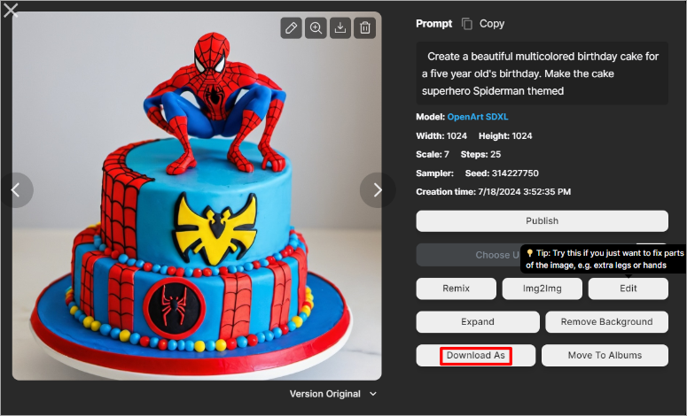
Over the past few years, we have seen significant growth in the quality of AI images. Today, you can use tools like ChatGPT and OpenArt to describe the image you want through text. The tools will generate a unique, sharp image that fits all your criteria.
AI-generated images can quickly help you create visuals that align with your brand’s message without needing expensive photoshoots or extensive graphic design work. This approach not only saves time and money but also ensures that your landing page stands out with unique and relevant images.
The problem with this is that you will need to manually download and move the AI images back to your WordPress site. This can quickly become overwhelming especially if you need to create multiple landing pages on different websites.
Luckily, there is a solution for this!
Tools like SeedProd and Divi come with built-in AI image generators, allowing you to create high-definition images directly within WordPress. This makes the process easy, ensuring that your visuals are both eye-catching and relevant.
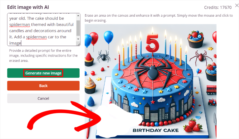
For example, with SeedProd, the AI image generator creates multiple images for you so that you can select the one that best fits your needs.
On top of this, you can select a section on the AI image and provide additional information on what you need on the image. SeedProd will then enhance the image with your instructions to the specified area on the photo.
Check out this article for a complete guide on 3 easy ways to add unique AI images to WordPress.
Now, the problem with images is that they can take up a lot of space on the landing page. This can lead it to look crowded, reducing the conversion rate.
A good solution is utilizing “sliders” for better content organization.
You can use Soliloquy, the best slider plugin. This plugin is an excellent way to present multiple images, products, or logos without overcrowding your landing page.
As a result, sliders are powerful tools for storytelling. They can help you tell your brand’s story, making your landing page more memorable and effective in driving conversions.
You can showcase various content pieces in a single location, making your page cleaner and more organized. This improves the visual appeal and helps deliver information more effectively, leading to better user engagement.
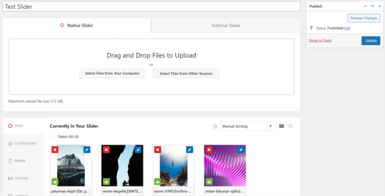
Soliloquy also helps you create video and PDF sliders, perfect for displaying conversion-focused content in a small area.
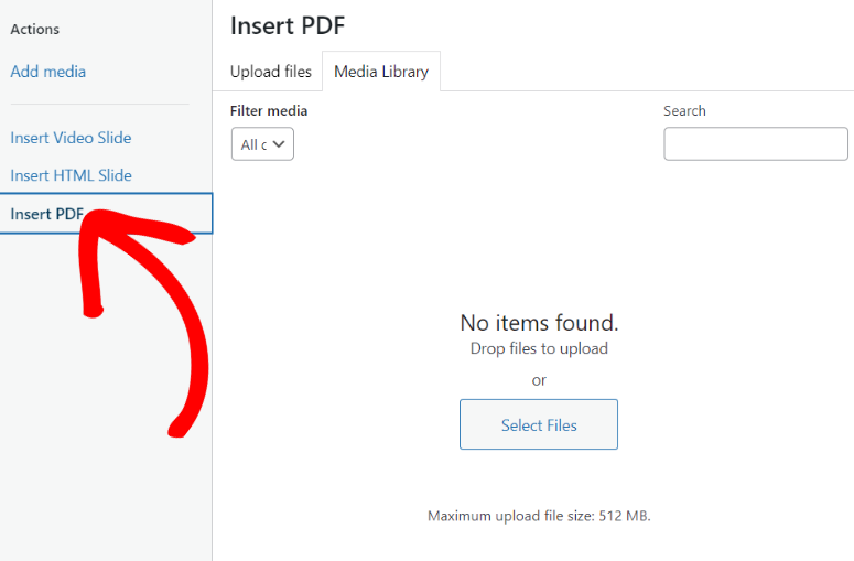
Check out this Soliloquy review for more details on this slider plugin.
While sliders are great at conveniently showcasing different types of content, they are static. You will need to manually change them to update your page.
Using social media feeds is a simple way to make your images dynamic.
Adding social media feeds to your landing page can enhance user interaction and keep your content fresh. Tools like Smash Balloon allow you to embed live feeds from platforms like YouTube, Instagram, and Facebook, ensuring that your landing page always displays the latest posts.
With Smash Balloon, the images from your social media accounts are accompanied by captions, hashtags, and more.
This ensures you can enjoy the SEO benefits of these social media posts on your site. On top of this, visitors can engage with your brand directly from the feeds through likes, comments, and shares.
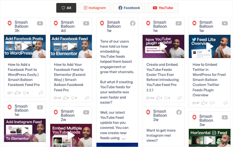
You can style feeds from Smash Balloon to match your landing page style, ensuring they do not feel out of place.
5. Capture Leads with Optin and Lead Forms
One of the most effective ways to boost conversions is using optin and lead forms to collect user information. This approach lets you capture leads from users who may not be ready to buy immediately but are interested enough to share their details.
Using form builder plugins like WPForms can make this process seamless.
WPForms offers over 1800 templates and a drag and drop builder. This makes building forms that suit your specific needs easy.
For example, you can use the Lead Form Template which comes with an in-built page break so that you can show one question at a time. This form automatically captures the information after each question. As a result, you can save important user information even if they do not submit the form.
If the pre-built templates don’t meet your exact needs, you can easily customize them. Adding a page break like the one with the lead form template allows you to present more questions on the form slide without overwhelming the user.
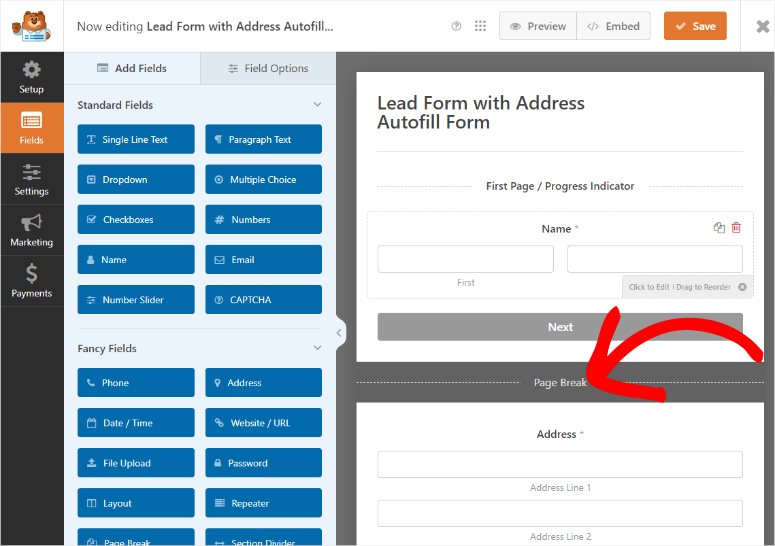
You can also add multiple-choice options and other fields to make completing the form easier and faster for your users.
Check out the latest WPForms review for more details.
Another powerful feature of WPForms is conditional logic.
This feature tailors the form questions based on responses, ensuring that users are only shown relevant questions. This personalization can significantly enhance user experience, leading to higher conversion rates.
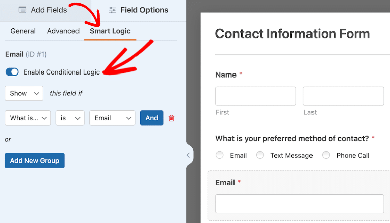
Here is a list of the best form builders with conditional logic to get you started.
Apart from making the form user-friendly, display timing can also improve conversions.
Simply displaying optin forms on your landing page is not enough—you need to ensure they appear at the right moment to maximize conversions.
This is where using OptinMonster comes into play.
OptinMonster can help you time the display of your forms, ensuring they pop up when the user is most likely to engage with them.
For example, Exit-Intent technology detects when a user is about to leave the page and triggers a popup at that exact moment. By catching the user’s attention just as they’re about to exit, you can present a compelling offer or simply ask for their email, increasing the chances of conversion.
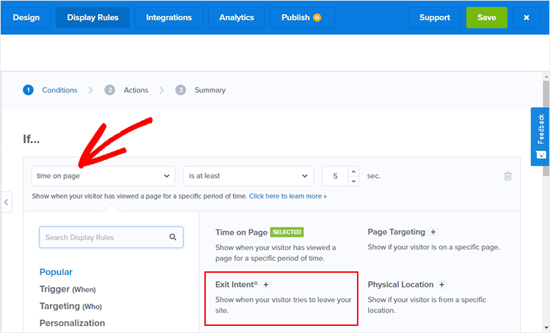
With OptinMonster, you can further refine your targeting by utilizing geolocation, device type, and other factors to ensure your forms are shown to the right audience at the right time. This customization improves user experience and boosts your chances of converting visitors into leads.
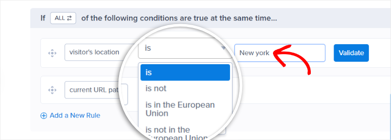
You can also create different types of popup campaigns with OptinMonster.
Using its drag-and-drop builder, you can create beautiful popups that match your brand’s aesthetic. With access to over 700 templates, you can design various types of campaigns, including lightbox popups, floating bars, and more.
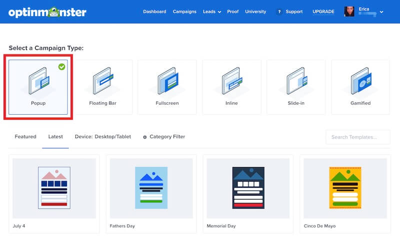
These popups can be integrated with most email marketing tools, allowing you to follow up with leads effectively and increase conversion rates.
Check out this OptinMonster review to learn all you can do with this optin plugin.
5. Build a Sense of Urgency
When visitors feel they need to act quickly, they are more likely to convert. This is why businesses often use phrases like “limited time offer” or “only a few products left in stock” on their landing pages.
These tactics create a feeling of scarcity, making your product or service feel more desirable.
One of the most effective ways to build urgency is by using countdown timers.
These visual elements emphasize the need to act quickly, triggering the fear of missing out (FOMO). Countdown timers can be used for various purposes, such as holiday promotions, flash sales, or limited edition products.
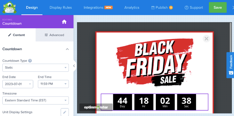
With OptinMonster, you can create customizable countdown timers.
With this leads plugin, you can display the same countdown timer to all visitors (static). Or a dynamic countdown timer that changes based on when each user views the offer.
These timers can be added to popups, floating bars, fullscreen welcome mats, or inline widgets, making them versatile tools for driving conversions.
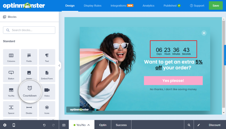
You can utilize Exit-Intent technology from OptinMonster as well to build a sense of urgency.
As mentioned, this feature detects when a visitor is about to leave your site and triggers a popup with a compelling offer. To take advantage of FOMO with OptinMonster, you can present a limited-time discount or an exclusive deal just before they exit the page.
This last-minute nudge can be the difference between a lost visitor and a new customer. By offering something of value at the moment they’re about to leave, you give them a reason to stay longer and complete their purchase.
To get started, check out this article for the best countdown timer plugins.
6. Improve Landing Page Engagement
Engagement is one area of a landing page that many businesses overlook. Many think that engagement is not an important part of a landing page because the focus is on conversion.
But, even though this is true, there are different types of engagement that you can incorporate on your landing page, not just comments and shares.
For example, improving the bounce rate of your landing page is an important engagement element that can skyrocket your conversions. The best way to ensure you improve your bounce rate is by grabbing and keeping your users’ attention.
One of the most effective ways to capture and retain visitors’ attention is to incorporate videos.
Videos can simplify complex information, showcase your product in action, and build trust with your audience.
Plus, they are highly engaging and can communicate your message more effectively than text alone. They can also evoke emotions and create a personal connection with your audience, leading to higher conversion rates.
One way to add videos to your landing page is using WordPress page builders like Divi, SeedProd, or Thrive Architect.
These drag-and-drop page builders come with video blocks. As a result, you can add the video to any location on your page straight from your WordPress Library. On top of this, you can use SeedProd to let the user view the video in a lightbox, which ensures the video covers their entire screen.
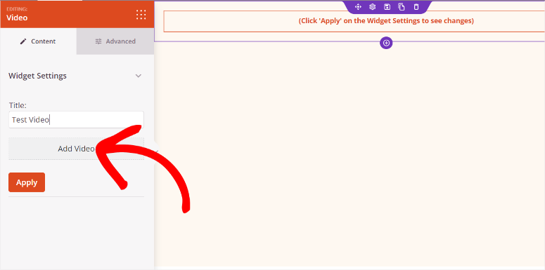
While you can upload and display videos from your WordPress Library, be aware that this can slow down your page load time.
A better option is to embed videos from other platforms.
Divi, SeedProd, and Thrive Architect allow you to copy the link from any YouTube or Vimeo and display it on your landing page. You can also add a caption and video description, ensuring the video is accompanied by written content.
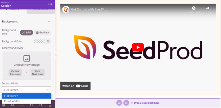
You can then customize the embedded video by adding features like autoplay, loop, controls, and more. On top of this, you can also style the video block by adjusting the padding, margins, borders, and other design elements.
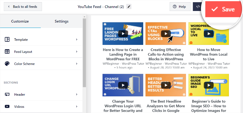
If you want to embed multiple videos, consider using Smash Balloon YouTube Feed.
Smash Balloon YouTube Feed allows you to display multiple videos without compromising site speed, as the videos are hosted externally. You can filter which videos you want displayed using keywords and even show live YouTube streams.
The best part is the feed automatically updates with your latest content, ensuring that your landing page always features fresh, relevant videos.
Check out this article on how to embed YouTube videos on your WordPress site.
Another way to improve engagement is by “gamifying” your landing page.
Gamification taps into the natural human desire for competition and reward, making your page more fun and memorable.
When users interact with a gamified element, they feel a sense of excitement and anticipation. Winning a prize or achieving a high score can create a positive association with your brand, increasing the likelihood of conversion.
As a result, adding interactive elements like “Spin the Wheel” can significantly enhance user engagement on your landing page.
We recommend you use OptinMonster to add a Spin the Wheel feature to your landing page.
OptinMonster allows you to easily add this gamification element to your site with a drag and drop builder.
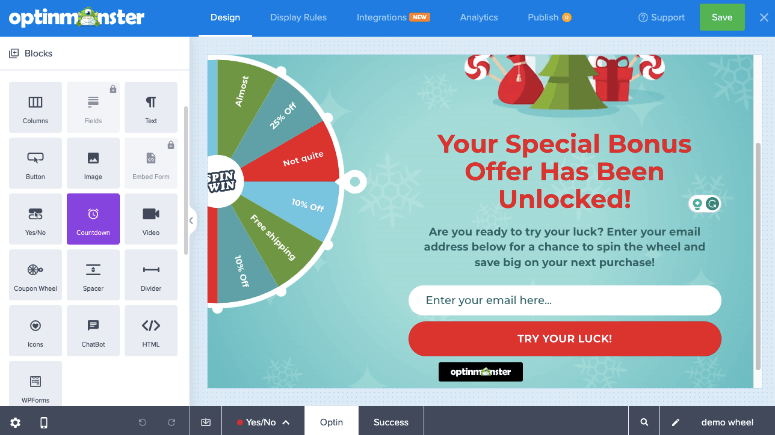
You have complete control over the design, win probability, and display rules, ensuring the game is tailored to your audience. You can choose to display the wheel to first-time visitors, returning users, or those who are about to leave the page, maximizing its impact.
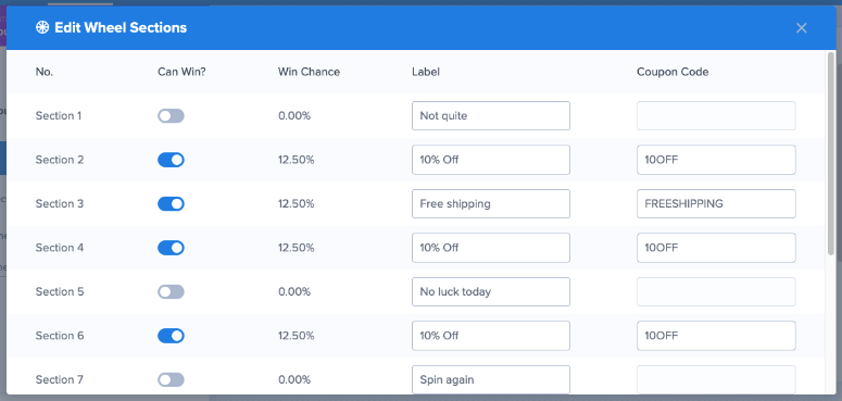
As you can see, there are many ways to improve your landing page conversions. Apart from the tips and tools above, here are additional ways to improve your landing page.
- Live Chat: Live chat allows you to engage with visitors in real-time, answering their questions and resolving any doubts they might have about your product or service. This immediate interaction builds trust and can significantly improve the chances of converting visitors into customers.
- Mobile-Friendly Design: With the increasing number of users browsing on mobile devices, having a mobile-friendly design is crucial. A responsive layout ensures that your landing page looks and functions well on screens of all sizes, providing a seamless user experience. This not only improves user satisfaction but also increases the likelihood of conversions. This is because visitors are more likely to stay and engage with your content.
- A/B Testing: A/B testing is a powerful tool for optimizing your landing page’s performance. You can test different variations of key elements, such as headlines, images, and call-to-action buttons. This can help you determine which version resonates most with your audience. Continuous testing and tweaking based on data-driven insights allow you to fine-tune your landing page for maximum conversions.
- Optimize Page for Speed: Page speed plays a vital role in keeping visitors on your landing page. A slow-loading page can frustrate users and lead to high bounce rates, negatively impacting conversions. You can optimize your landing page by compressing images, leveraging browser caching, and minimizing code. This can result in a faster, smoother experience for your visitors, increasing the likelihood that they’ll stay and take action.
Congratulations! You can now improve your landing page conversions with these tips and tools. If you have any more questions, check out the FAQs below.
FAQs: Landing Page Tips and Tools to Improve WordPress Conversions
What are the 3 most important elements of a landing page?
The first and most important element for a landing page is a clear and precise call to action. This will communicate to your users what action they need to take on your site. The next most important landing page element is social proof to help build user trust. Here, you can add things like testimonials, reviews, and other social proof queues. Thirdly, you need to improve engagement to ensure your users stay on your site longer, increasing their probability of taking action. To do this, you can add engagement elements like spin the wheel, videos, animations and so on.
What is the best free landing page builder?
SeedProd is the best free landing page builder. It comes with 300+ ready-made templates you can quickly customize with a drag and drop builder. It is mobile-friendly and allows users to engage with your landing page on any screen size. Plus, you can connect it with most third-party email providers to help you grow and nurture your subscriber list.
How much content should my landing page have?
There is no set amount of content you should add to your landing page. But, many experts advise that the content length on a landing page should be at least 500 words. This allows you to add enough information about your products or services without crowding your landing page. Also, make sure you create catchy headers and add images and videos. Most importantly, make sure you have a clear call to action for your users, giving them a precise path to conversion.
Are landing page campaigns better than email marketing?
A landing page offers a focused and targeted message for your visitors, leading to a quick way to get leads and sales. While email marketing builds a long-lasting relationship with your users by giving them ongoing value. As a result, email marketing allows you to communicate and nurture your leads directly. Rather than choosing one over the other, the best strategy often involves integrating both. Use email marketing to drive traffic to your landing pages and landing pages to convert those clicks into actionable results.
Final Verdict: Should I Optimize My Landing Page?
Yes, and the sooner, the better.
Every day your landing page underperforms is a day you’re leaving leads and sales on the table. The traffic is already coming. The tools are already within reach.
You don’t need a big budget or a developer. You need the right structure, clear trust signals, and a CTA that tells visitors exactly what to do next.
Start with one change: tighten your headline or add a social proof element. See what happens. Then layer in the rest.
A high-converting landing page isn’t built overnight. But with the right tools in place, every update gets you closer to a page that actually works for your business.
👉 Pick one tool from this guide and get started today.
We hope you enjoyed learning about tips and tools to improve your conversion rate. If you want to get leads more effectively, check out this review on Thrive Leads.
Related Guides
- Best WordPress Landing Page Plugins – Side-by-side comparison of the top page builders for WordPress
- Best Social Proof Plugins for WordPress — Tools to add trust signals and boost credibility
- Best WordPress Lead Generation Plugins — Grow your email list from your landing pages
- Best WordPress A/B Testing Tools — Test and improve your pages with data
- Best WordPress Form Plugins — Capture leads directly from your landing page
- How to Speed Up WordPress — Improve page load time and stop losing conversions
- Best WordPress Countdown Timer Plugins — Add urgency to any landing page
- Best WordPress Testimonial Plugins — Display customer testimonials the right way
Comments Leave a Reply